Summary:
An analysis of economic data over the past 50 years attempts to determine which political party are better stewards of the economy.
The data suggests that:
The following analysis was originally authored as a series of posts over a period of several months at the Angry Bear economists blog. The blog consists of many regulars most of whom have a PHD in economics. All of the charts and graphs (except the first and the last) come from these series of posts. All of the original posts are linked in the title of each section heading. The original posts contain links to the original data tables (mostly the US Department of Commerce's Bureau of Economic Analysis and White House Office of Management and Budget (OMB) ) and the rational behind the analysis. The comment section from each post contains lively debate by which the direction of next series was determined. The following summary is offered because most people do not have the time to read through the many original posts.
--------------------------------------------------------------------------------------------------------------------------------------------------
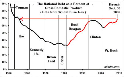
The National Debt:
This first section exams the National Debt as a function of Republican and Democratic presidential terms. This graph clearly shows that the National Debt as a percentage of GDP decreases or is at least flat when a Democratic President is in the Oval Office. By contrast the National Debt rose significantly under the two Republican Presidents that fully implemented Supply-Side economic theory.
Note that the Debt (as a percentage of GDP*) starts high on this graph due to WWII, but is steadily decreased by Eisenhower (R), Kennedy (D) and Lyndon Johnson (D). The National Debt also decreased under Nixon (R) and Ford (R) but at a slower rate. It is important to note that the aforementioned administrations were able to reduce the National Debt as a percentage of GDP despite funding the Korean War and Vietnam War.
Jimmy Carter (D) continued the slow trend of reducing the National Debt before it exploded under Ronald Reagan (R) who cut taxes without reducing spending. The Clinton (D) administration who raised taxes moderately oversaw a period of federal budget surpluses and a relatively sharp reduction in the National Debt. The Bush (R) administration again grew the National Debt by virtue of tax cuts and increased spending (including two foreign wars not funded).
*UPDATE: The chart does not include the Obama administration during which the National Debt has risen sharply, but an analysis here shows that up to 75% of the debt increase can be attributable to Bush era policies, most notably the Bush tax cuts, and the response to the Financial Crisis of 2008.
(*In absolute dollars the debt has grown from $270 billion in 1946 to about $15 trillion today)
This section examines the growth of the nation's Gross Domestic Product (GDP). GDP is a measure of national income and industrial output and as such is a major indicator of the strength of the economy. The table below shows the annualized percentage change in real GDP per capita associated with recent Presidential administrations. Also shown is the change in real GDP per capita when an administrations' best and worst year are left out.
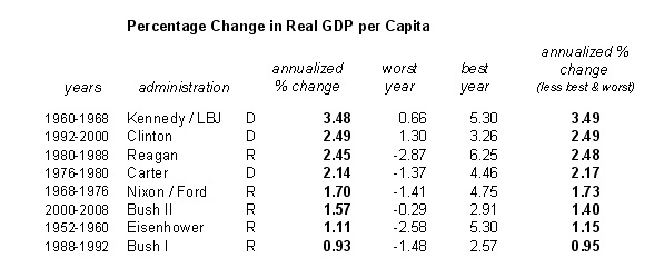
Growth rates in real GDP per capita tend to be higher under Democrats than under Republicans. The three Democrat administrations are all in the top four with Reagan the only Republican to crack the top half. All four of the slowest growing administrations were Republican.
GDP Growth Minus Debt (and monetary policy):
The next analysis attempts to determine whether the Democrats above were simply the beneficiaries of an expansionary monetary policy assuming that monetary policy has an effect on GDP growth. To do so we need to look at the change in the real Money Supply per capita; the change in the amount of M1 or M2 per person above and beyond inflation. In economics M1 and M2 are measures of money supply. M1 is the physical currency circulating in the economy plus demand deposits. M2 is M1 plus time deposits, saving deposits and non-institutional money market funds. The table below shows the annualized percentage growth in real GDP ( less debt) per capita, the annualized percentage change in real M1 per capita, and the annualized percentage change in real M2 per capita for the various administrations beginning in the sample. It also shows the correlation between the growth rates in Money and the growth rate in the economy:
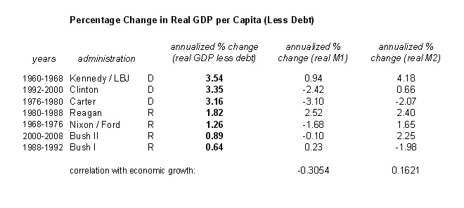
So what does this mean? It means that with the exception of George W. Bush, the more beneficial the monetary policy, the better the growth rate under both Republican and Democratic Presidents. But the Democrats still did better growing the economy even though the the Republicans were operating with a more favorable monetary policy. (It is another question as to why the Fed was biased towards giving Republicans a more favorable policy).
But what about the role of Congress in GDP growth? After all, Presidents often have to work with a Congress controlled by the opposite party. The following chart shows the GDP per capita for all the combinations of Presidents and Congresses. The number of observations is the number of times that particular combination has occurred. The table also shows the effect of just Congress itself:
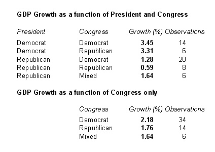
Again growth rates of real GDP less real increases in the debt per capita are higher under Democratic Congresses than under Republican Congresses. The highest growth is observed when both the President and the Congress has been Democratic. And the lowest growth is observed when the President and the Congress were both controlled by Republicans.
There are a number of other explanations for the results of the above analysis. One of these is the idea of "lag" (where one administration benefits from the time delayed policies of a previous administration), however, a logical analysis seems to rule this idea out. Another explanation is that Republican administrations were the victims of recessions due to business cycle reasons out of their control. The following table shows GDP growth performance for each administration with recessions removed and the eight quarters past the recession removed:
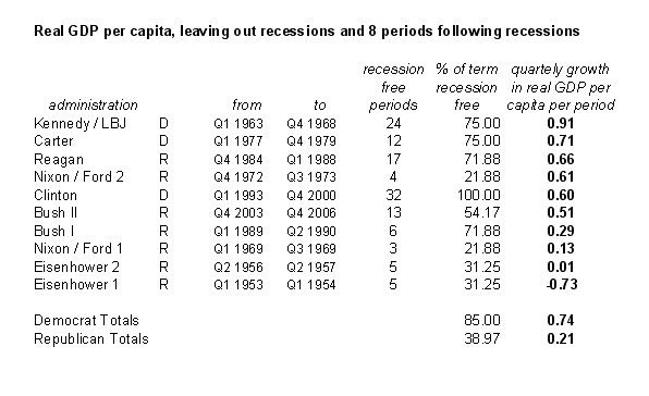
So what does this show?
First it reveals that Americans spend much more time in recession when Republicans are in office than when Democrats are in office. Furthermore, despite leaving out the recessionary periods, growth is still faster, on average, under Democrats than under Republicans. It is worth noting that the whole point of this chart is to effectively cherry pick the Republican's best economic periods. This makes Clinton look a bit worse, but that is because his entire term (fully recession free) is now going up against only the best four quarters of the Nixon administration and only about 75% of the Reagan administration. But Clinton’s entire term still beats a cherry-picked George W. Bush term. The same analysis was repeated without excluding the eight quarters after the recession, but the results were the same.
Size of the Federal Government:
This section examines the size of the government, a topic of critical importance to conservatives and libertarians. This chart shows the change in the number of Federal Employees per thousand of the U.S. population:
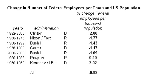
Contrary to conservative lore, Reagan was one of only two administrations to increase the number of federal civilian employees. Clinton and Carter both shrank the government more than Reagan and George W. Bush. But what about total government, not just Federal employees? Here is chart showing all government employees - Federal and Sate:
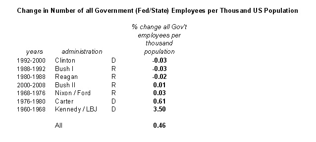
Even taking into account all government (Federal and State) Clinton still reduced the number of government employees the most. (I'm not sure how fair this metric is as a President has far less control over a State's government than he does over the Federal government.)
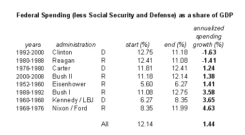
This section examines Fenderal spending by the government, perhaps the most important topic to conservatives and libertarians. The following table shows Federal Spending growth as a share of GDP minus Social Security which is outside the control of any given administration:
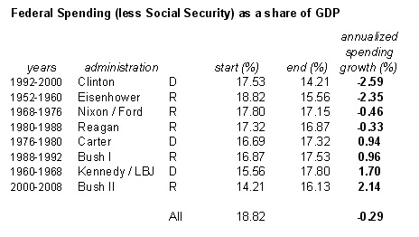
That Republicans favor small government is so often repeated that it is almost an axiom. Yet Clinton trumps all Republicans and even Jimmy Carter trumps both Bush presidencies in reducing Federal Spending growth. It is worth noting that this metric is not even a stated goal of most Democrats, yet they have performed as well or better in this area than Republicans for whom it is very clearly a stated goal.
Also worth noting is that Clinton's annualized shrinkage from 1992 to 1994 was 3.26%. From 1994 to 2000 it was 2.37%. This means that Gingrich's Republican Revolution and subsequent control of congress actually hurt Clinton's ability to shrink Federal Spending. One counter argument is that Clinton would have spent more if his Health Care plan had gone through.
(All this does make one wonder why Republicans hate Clinton so much. He had the second best GDP economic growth in the sample, he was fiscally responsible and he reduced the size of government.)
Federal Spending minus Defense Spending:
Some arguments speculate that Republican spending looks worse because of defense spending. These tables look at federal spending deltas minus defense spending both as a share of GDP and in real dollars.
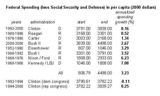
These tables show that every single President increased spending on non-Social Security and non-defense items per capita. Clinton increased spending the least, but he was actually cutting spending per capita before the Republican Congress took over. Reagan increased this type of spending by more than three times Clinton and more than three times Carter. Carter actually came in third increasing spending per capita at half the rate that George W. Bush did.
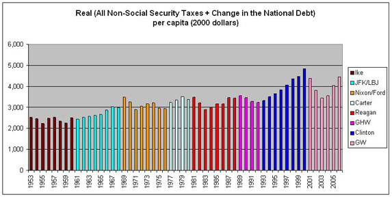
This table shows the total taxes per capita other than social security collected plus changes in the national debt held by the public, all as a percentage of GDP. This measure of taxes takes into account the fact that a run-up on debt has to be paid off at some point.
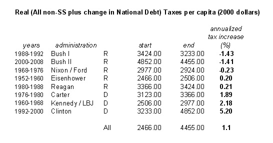
Here all the Democrats are at the bottom of the table as one might suspect from Republican rhetoric. But notice that all the administrations with the best GDP growth are at the bottom of the table including Ronald Reagan. This would seem to indicate that while tax rates were higher under the Democrats and Reagan they were on the correct side of the Laffer curve. The Laffer Curve illustrates the idea that increases in tax rates will eventually lead to a decrease in tax revenue because high taxes will dis-incentivize business and job growth. This is the central idea of supply side economic theory. Similarly, the table suggests that the Bush tax cuts are too deep, lowering revenues and increasing debt. Further analysis of the data revealed an optimal growth point. Based on that analysis, the following Presidents moved tax rates in the direction most likely to lead to faster growth in real GDP per capita: Eisenhower, JFK/LBJ, Carter and Clinton. The following Presidents favored tax policies that moved the country away from this faster growth point: Nixon/Ford, Reagan, Bush I and Bush II.
Lower taxes are a powerful attraction, but are policies that offer to lower taxes reason enough to justify favoring one candidate over another when the data suggests it results in a sluggish economy, median income loss and skyrocketing debt?
The last metric is job growth. This graphic shows job growth index for all administrations beginning in 1921:
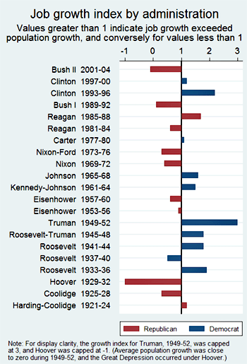
Only Reagan produced significant job growth among Republicans.
Conclusions:
In repeated metrics the Democrats performed better or equal to Republicans on all of the above economic areas. What is a fiscally conservative person supposed to make of this? Assuming the data is valid (remember all of the data is from the OMB or the US Department of Commerce and many knowledgeable people participated in shaping and critiquing the analysis) it is hard to attribute the Democrat's surprising performance as sheer luck. Lets assume that there is enough wiggle room in the data and analysis to assume a wash between the two parties. A wash still bursts the idea that there is a significant let alone positive impact in implementing conservative supply side economic policy. Again, please read the links for arguments and counter-arguments.